Tuesday, December 10, 2013

three pillars of photography


1. What part of the body should we closely relate aperture? 
to the main person or subject of the camera 


2. Finish this sentence - the smaller the Aperture ___smaller values__, the higher the Aperture ___larger values ___.


3. In your own words tell me how aperture impacts Depth of Field? 
the depth of field controls the blurriness it sharpens the picture. 

Caption Writing: 5 Ws and H

1.) Joey Gray kisses Beth Gonzalez on Friday at 2:30 p.m in Times Square in New York City ,Gray excitedly grabbed Gonzales when the news announced that the allies had defeated the Nazis, ending WWII.


2. Good Year blimp crashes into Seattle's Space Needle in 7:45 Sunday morning, Pilot Jose Jaimes was reportedly drunk when many survivors testified against him. 


3. Five decades after her death , marilyn monroe remains one of hollywoods most adored sex symbols, 1954 image of her posing over a new york city subway grate in character for the filming of the seven year itch.  


great black and white part 3


Tip 1: Bring Something to Focus On

The problem that I saw when I looked through my viewfinder was that I didn't have anything to focus on aside from the items in the far distance. This of course would make for a perfectly blurry photo of me, which isn't at all what I wanted.
One easy solution to this problem is to bring something to stand in your place. Height doesn't matter so much as distance, but try to match it to yourself as best as you can for accuracy. If you have an extra tripod or light stand, these make perfect substitutes that will stand upright exactly where you need them. I was out in my yard so I grabbed a shovel from my shed, stuck it in the ground, focused and then moved the shovel. Rudimentary, but it worked perfectly.

tip 2 : Set the Timer High and Use Burst

Obviously, you don't want to have to haul all out and run into the frame just as your camera takes the image. Give yourself plenty of time to get in position and figure out what you're doing. Most cameras let you vary the length of the timer, check your manual for how to set yours.
In conjunction with the timer, you can usually set your camera to take multiple photos in succession. Even if all you need is one photo, it's not a bad idea to have your camera snap five or ten so you can vary your pose/expression. This will give you much more variety when it comes time to choose the image. Just make sure you have your settings perfect before turning burst on, otherwise you'll have a card full of unusable shots.
Tip 3 :Use Both Auto and Manual Focus A good practice to get into when you're taking self-portraits is to use a mix of auto and manual focus. First, focus on your stand-in object using auto focus. Then, with the object still in focus, switch your lens to manual focus.
This will give you the freedom to tweak settings, re-meter for changing light and anything else you need to all without screwing up your established point of focus. Just make sure you stand perfectly on your mark each time you take a photo.
Environmental portrait:


Casual portrait :


Formal portrait:


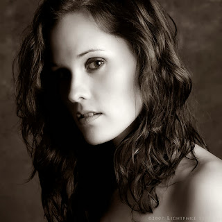
photography self portrait : 


I'm going to be taking my subject to the courtyard out in the sun, i will shoot my partner either by a tree or tables i will need good lighting. 


Friday, December 6, 2013

skyscrapers

1. Rule of thirds


2. Balancing Elements 


3. Leading Lines


4. Symmetry and Patterns (repetition)


5. Viewpoint


6. Background 


7. Create depth


8. Framing


9. Cropping


10. Mergers and avoiding them


Monday, October 21, 2013

Academic shoot reflection


1. What challenges did you encounter while trying to get the photos following the rules I set out for you? 
- trying to find the right photo for the subject.

2. What technical aspects of photography or the assignment in general (focus, framing, holding the camera, etc.) did you find yourself thinking about the most? Provide a specific example of what you did to do this correctly.
-holding the camera and focusing the camera.


3. If you could do the assignment again, what would you do differently now that you know some basic rules of photography?
-take better pictures of the subject  and better focusing.

4. What things would you do the same?
- go to some of the same places to take some good pictures.

5. When you go out with your next set of prompts, which rule do you think will be the easiest to achieve?
-the lines set of prompts.

6. Which rule do you think will be the hardest to capture?
-the framing set.

7. What rule are you still not totally clear on and what can you do to figure out what that rule is?
-the avoiding mergers rule and i could look up what it means so it can be clear to me.

Thursday, October 17, 2013

Academics shoot

Academics shoot 


lines: 
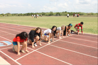
1:well in this picture it has lines with a group of students taking a position.
2: the subject is a running pose with lines.
3: Yes my photo is clear to the subject. 
4: what I could of done differently was take a better view of the lines.

simplicity: 
                       1: in this photo it shows a blank background with just one person. 
                       2: the subject is nothing in the background just something plain.
                       3: yes it is clear to people if they looked at this photo. 
                       4: the thing that i could of done differently was take a better angle.

rules of third:
1: in this photo it shows that no one is in the middle of the picture. 
2: the subject of the photo is no nothing being in the middle of the photo.
3: i think i can be clear for people to understand this picture.
4: the thing i could of done differently is maybe take the photo from the middle of the gym.

balance:
1: in this photo it shows balance by seeing the guy jump.
2: the subject of the photo is seeing something balance with out falling or going wrong.
3: i think that this photo can show people what i mean.
4: the thing that i could of done differently is that i should of focus the camera better.

framing:
1: in this photo it shows that there in a class. 
2: the subject of the picture is framing and making it look almost like a actual frame.
3: i think that this photo people wouldn't really understand this.
4: i think what could of done differently is actually take a better photo with actual framing.

avoiding mergers:
1: in this photo it shows that I'm trying to avoid merger. 
2: the subject of this picture is that when i take this photo i shouldn't have any mergers.
3: i think that this photo people would sorta understand this photo.
4: i think i could done differently was maybe focus more and take it from farther away. 


Wednesday, October 2, 2013

Academics photo shoot preview

the story:
Photographer: Casey SimmonsWestlake High School, Austin, TX
Adviser: Cindy Todd
it looks like they where having fun with an experiment that showed a crazy reaction.
Action or emotion : they look excited also in chock and happy that the reaction of experiment came out like that and it looks amazing and fun.


fills the frame: this photo fills the frame because its mainly on her and what she is doing smelling some chemicals its showing her action. 


1. I choose this photo because its creative and the photo was taken right when the reaction happened.
2. some rules is that the photo is mainly on the reaction.


Monday, September 30, 2013

Balance: balance is the comfortable or pleasing arrangement of things in art. There are three different types of balance: symmetrical, asymmetrical, and radial. The human figure is symmetrically balanced; the same on the left and right side. The tree is asymmetrically balanced; its branches are not distributed equally on each side, but their total weight is balanced left and right. The sun is an example of radial balance; all its rays are equal in length from the center.


Contrast:Contrast is created by using elements that conflict with one another. Often, contrast is created using complementary colors or extremely light and dark values. Contrast creates interest in a piece and often draws the eye to certain areas. It is used to make a painting look interesting.


Emphasis:Emphasis in the focal area of an artwork gives it importance. An artist may stress some elements of the design over others. The eye of the viewer will focus on the area of emphasis or center of interest first, then take in the rest of the composition.


Movement: Movement in an artwork means the artist is taking viewers on a trip through the work by means of lines, edges, shapes, and colors often leading to the focal area. Movement is a visual flow through the composition. It can be the suggestion of motion in a design as you move from object to object by way of placement and position. Directional movement can be created with a value pattern. It is with the placement of dark and light areas that you can move your attention through the format.


Pattern:Patterns are made in art when the same shapes or elements are repeated again and again. Pattern uses the elements of art in planned or random repetitions to enhance surfaces of paintings or sculptures.


Rhythm:Rhythm is the repetition of shapes, lines, and forms. Rhythm is a movement in which some elements recurs regularly. Like a dance, it will have a flow of objects that will seem to be like the beat of music.


Unity:Unity means that all elements in an artwork are in harmony. Unity brings together a composition with similar units. For example, if your composition was using wavy lines and organic shapes you would stay with those types of lines and not put in even one geometric shape.


Elements of art

Line : Lines are marks made by a pointed tool: brush, pencil, pen, etc. Lines can vary in width, direction, curvature, length, or color. 


Shape :  Shapes are formed wherever the ends of a continuous line meet. Geometric shapes such as circles, triangles or squares have perfect, uniform measurements and don't often appear in nature. Organic shapes are associated with things from the natural world, like plants and animals.


Color : Color wheels show the primary colors, secondary colors, and the tertiary (intermediate) colors. They also show the relationships between complementary colors across from each other, such as blue and orange; and analogous (similar or related) colors next to each other such as yellow, green, and blue. Black and white may be thought of as colors but, in fact, they are not. White light is the presence of all color; black is the absence of reflected light and therefore the absence of color.


Value (Tone) : Value, or tone, refers to dark and light; the value scale refers to black and white with all gradations of gray in between. Value contrasts help us to see and understand a two-dimensional work of art.


Form : Form describes objects that are three-dimensional, having length, width, and height.


Texture : Texture can be rough, bumpy, slick, scratchy, smooth, silky, soft, prickly--the list is endless. Texture refers to the surface quality, both simulated and actual, of artwork.


Space : Space refers to distances or areas around, between, or within components of a piece. Space can be positive (white or light) or negative (black or dark), open or closed,shallow or deep, and two-dimensional or three-dimensional.


National Geographic photo

 this photo is my favorite photo because in her eye we see what she sees, we see her way of viewing things, meaning what she is looking at.

Great black and white photographers, PART 2

 this photo is my favorite black and white photo because this photo shows a young girl happy in a beautiful white dress it looks like she's dancing or just moving around happily she looks mysterious.

photographer: yousuf karsh
born :1908-2002
he's one of the masters of 20th century photographer, His work includes portraits of artists, musicians, authors, scientists.
He grew up during the armenian genocide. 
he was born in martin.